“beyond the best” is a new slogan that embodies the determination of Kumho Petrochemical Group to provide more than the best values to our customers while breaking away from simple goals, such as corporate growth.
FORMATION
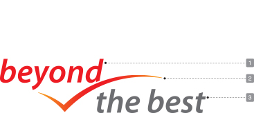
Concise writing symbolizes Kumho Petrochemical Group as corporations specializing in petrochemicals and their honest and transparent managements.
The red line giving a sense of resilience and bounce symbolizes forceful challenges and achievements of Kumho Petrochemical Group to create more than the best values.
COLOR
The red and green used in the slogan logo mean the consistency and permanence of the corporation: Kumho Petrochemical Group have used them all these years.
Color System
PANTONE
1797C
CMYK
C 0%, M 100%, Y 100%, K 0%
RGB
R 237, G 28, B 36
PANTONE
138C
CMYK
C 0%, M 50%, Y 100%, K 0%
RGB
R 247, G 147, B 30
PANTONE
Cool Gray 10C
CMYK
C 0%, M 0%, Y 0%, K 70%
RGB
R 109, G 111, B 113
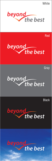
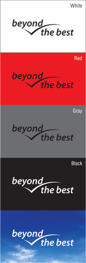
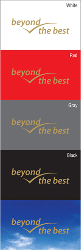
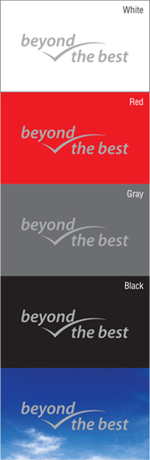
Color Used
Full Color
Black Color
Gold Color
Silver Color
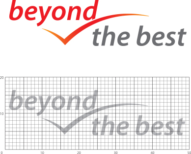
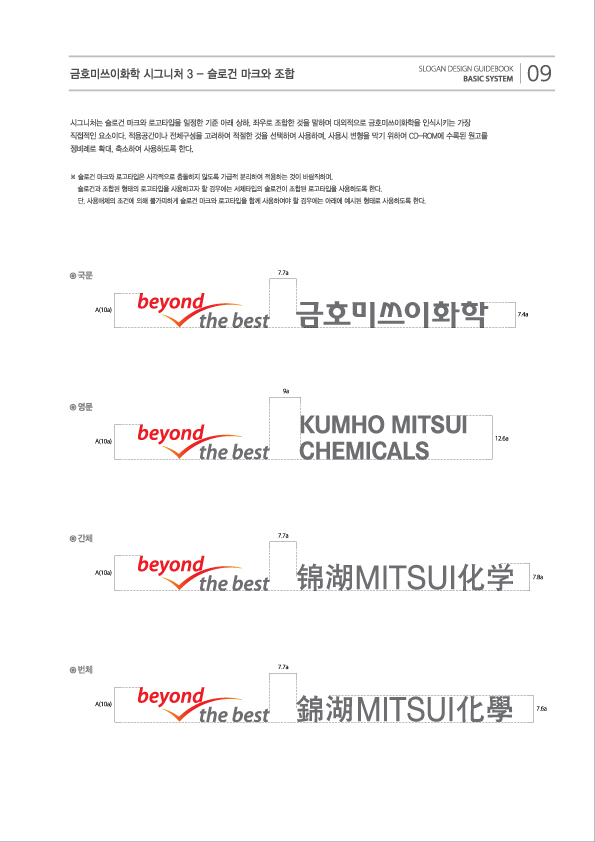
Horizontal Combination RuleIt can be used by zooming in/out in 1 to 1 ratio of horizontal vs. vertical sizes.


